
Friday, 25 March 2011
Final Teaser Trailer Magazine Front Cover
Final Teaser Trailer Poster

Tuesday, 22 March 2011
Certificate Ratings

Monday, 21 March 2011
Editing Footage - Finalising
Today we edited our footage again, however in this case we decided that as we have quite a lot of fast paced editing we should have something slower at the end to slow the pace down and then BAM there is the release date, so it slows the heart rate down a bit and then frightens the audience again. We have decided to have all of our footage played really quickly at the end of the film as it looks as if the film is undoing itself, as in the Victim wants to turn back time to ensure she never joined the Cult.
We did this by saving our footage as it was, then rendering it as an .avi file (Adobe Premier Elements, the software we are using). We then loaded the footage and put it in our film. At the end of the footage there is a scene where Milly writes on a piece of paper that she wants to join the clan, we reversed this so it looks as if she is rubbing out the writing, that she never wanted to join in the first place.
We then made the whole thing backwards so it starts with Milly writing that she wants to join the Cult and it ends with Milly being dragged through the Woods.
More Poster Ideas
Today we thought it would be a good idea to take some pictures for the Poster as the ones we have are not a very good quality. Here we have taken a few images of Alana, we are going to manipulate them to make them look scary.


Saturday, 19 March 2011
Todays Media Lesson - Poster
Yesterday in our double media lesson we had a go at trying to put together our Poster. We thought this went well however as we print screened the image from our Teaser Trailer the quality wasn't the best. We thought it was harder to use Adobe Photoshop so at first we tried it on paint and then we got some help on how to use Adobe and the quality came out better. I think we might possibly take some photos of Alana, the Killer again on either mine or Alana's digital camera as then the files will be of a higher quality. I think this process will enable us to make a higher quality poster, and we can make it to a specific size as the print screens from our Teaser Trailer could only be a certain size.
Friday, 18 March 2011
Editing Footage
Today we again edited out footage, Mr Oswick saw this and said that Horror trailers usually have really quick editing and then a slow pace of editing, so he thought that we should add some more in. Hannah had the idea of Alana, the Killer, running down one of the corridors at school wielding a knife. She would run towards the Camera with the mask on so that she looked scary. I think this is a good idea as we can also flick the lights on and off to create more suspense and tension.
Thursday, 17 March 2011
Production Choice
We, as a group have decided to use Legendary Pictures for our Production company. We have decided to use this because Legendary Pictures are most famous for the Saw franchise which is a well known set of Horror Films. Last year we used Working Title for the company which produces our film, but this year we decided against it as we couldn't think of any horror films in which Working title had produced or co-produced. Legendary pictures' introduction is very quick which is good as we are just going to flick it on between two of the scenes in our trailer to save on time as we would like to keep the Teaser Trailer under one minute.

Film Magazine Research - Positioning of the Magazine
Earlier I decided to compare the positioning of Total Film magazine and Empire Magazine. I uploaded the images onto Microsoft Word and then described the positioning of the the text and images on the front cover.


Wednesday, 16 March 2011
Film Magazine Front Cover Research - Possible Titles for our Magazine
Another possible name for our Film Magazine could be 'Horror Film'. As we are doing a horror film, both this name and the Horror Review idea are possibilities. and I like both of them. I have again used Microsoft word's Word Art to create this. I have stayed with the Red colour this time as in Horror films there is usually quite a lot of blood so I think this fits well. I have again used Calibri in size 150 for Horror and then size 36 for the Film bit. I am pleased with the final design of both of these ideas and I am not sure which name we will use for our magazine but both of these names are good.


Film Magazine Front Cover Research - Possible Titles for our Magazine
Here I have decided to play around on Microsoft word with the Word Art. I have used words which I think are good Magazine names. I have played around also with the colour of these words, I've also changed the size, and moved the 'review' word around to see where it fitted in the best. I used Calibri Font to create these words.
 I like on this one, how the Review is in the actual Horror word, I think this is similar to the Total Film title.

 This is the idea I like the most, as I think it is informative and it is not similar to any of the Magazines in which I have researched.


I like the Glow on the letters above. I think it really emphasises the red colour and looks really effective.

Film Magazine Front Cover Research - Total Film
I am now going to research Total Film magazine, as this is another mainstream film magazine. I think the same as before as Horror films are not really advertised within Media magazines, so it is probably a good idea that we are doing our own Film Magazine.
 Here is the Total Film Front cover for Inception. In the Total Film title you can see that the title has been edited to seem like it is part of a city, as it is an aerial shot of a city. I think they have done this because within the Inception film you are transported to many levels of dreams, and on many occasions you, as the audience, find yourself in a city setting. The nearly full length shot of Leonardo DiCaprio suggests that he is main character of this film and he has a shocked expression on his face which could tell us that he is worried or he is looking at something which has shocked him. At Leonardo DiCaprio shoulder the background changes, so that you can now see the side of a city building, at a human eye level, this could explain the different levels of dreams in which they enter. I think for our Front cover we should use the Total Film title idea to tie in with our Teaser trailer, as with the Empire Magazine as well.
 This is the Front cover for the Social Network, which is about the finders of Social networking site Facebook. As on Facebook, you have a profile and you can upload a picture of yourself for your profile I think the front cover is a really good idea, as the main picture and even the Total Film title is made up of hundreds of Profile Pictures. As nearly everyone uses Facebook, I think this was an imaginative idea for a front cover as not really anyone knew the basis behind where Facebook came from. From this I think we could possibly use lots of little pictures, perhaps of the victims in the film to make a main picture of the killer, however we have quite a tight time restriction and I think this will take too long but it is a good idea nonetheless.
Here is the Total Film Front cover for Inception. In the Total Film title you can see that the title has been edited to seem like it is part of a city, as it is an aerial shot of a city. I think they have done this because within the Inception film you are transported to many levels of dreams, and on many occasions you, as the audience, find yourself in a city setting. The nearly full length shot of Leonardo DiCaprio suggests that he is main character of this film and he has a shocked expression on his face which could tell us that he is worried or he is looking at something which has shocked him. At Leonardo DiCaprio shoulder the background changes, so that you can now see the side of a city building, at a human eye level, this could explain the different levels of dreams in which they enter. I think for our Front cover we should use the Total Film title idea to tie in with our Teaser trailer, as with the Empire Magazine as well.This is the Front cover for the Social Network, which is about the finders of Social networking site Facebook. As on Facebook, you have a profile and you can upload a picture of yourself for your profile I think the front cover is a really good idea, as the main picture and even the Total Film title is made up of hundreds of Profile Pictures. As nearly everyone uses Facebook, I think this was an imaginative idea for a front cover as not really anyone knew the basis behind where Facebook came from. From this I think we could possibly use lots of little pictures, perhaps of the victims in the film to make a main picture of the killer, however we have quite a tight time restriction and I think this will take too long but it is a good idea nonetheless.Film Magazine Front Cover Research - Empire Magazine
Here I have collected a few front covers of the Empire magazine. I think this would be a good magazine to analyse as it is one of the most well known media magazines. However, there are not many front covers in which there is a horror film on the front cover so I don't think it would be a good idea to use this as a basis for our Film Magazine front cover. We were told yesterday that we could produce our own film magazine so I think we are planning on something with the title Horror Film or Horror Review. I think we should keep the theme running throughout the Film Poster and the Film Magazine front cover, as this keeps the theme running of the Killer being the most important charater within our film, I think this is our Unique Selling point of our final products and hopefully if we keep this theme running then it will make our audience feel that they actually would like to see more than just the teaser trailer.


Here you can see the two different covers for The Dark Knight Film, these covers are based on the two main characters in the Dark Knight. I think this would be a good idea for our film magazine front cover as it draws the attention of the audience. Wherever you look it look as if the Joker and Batman are staring at you and it is quite unnerving. I think we should take this idea into consideration as we have a shot of the Killer where she is just staring at the into the camera, and her eyes look wild and she does look quite scary. If we don't think this shot suits the front cover of our Magazine then we can take a picture especially suited for the role. I like how the Empire title is also in the theme of the person on the cover, for example on the Jokers front cover there is an outline of Green which runs throughout the front cover, with the writing being in green and there being a green theme. As for the Batmans front cover there is a Blue theme running throughout and this shows the audience how different the two characters actually are.


Here are a few examples of some other films front covers on Empire. We have Hellboy 2, Kick Ass and The Hulk.I like the idea that Empire have changed the titles of thes of their magazine to fit in with the theme of the front cover, for what film is being advertised. As in one of these magazines it looks as if the Hulk is ripping through the magazine, as the P has been split into two. The Hellboys front cover is on fire thus enforcing the connotations of fear and hell into the title as this is what the film is about. Kick Ass is a fighting film. about an ordinary boy who decides that anyone can become a superhero, he however gets beaten up a lot on his way to accomplish his goal, this is why on the front cover he is bloody and Empire have changed their title to fit in with this, as it looks like someone has blood splattered the word 'Empire' onto the wall behind Dave. I think these are good ideas to consider when we are creating our own film poster. With the technology available to us I think we should be able to create a title which looks effective, as this is one of the things which is important when attracting an audience.
Tuesday, 15 March 2011
Possible Fonts and Colours for Film Poster
I am going to research on Microsoft word what fonts and colours we can use in our Film Poster, for the film title. Regarding my previous posts I think we should use a red coloured font, but this depends on whether we decide to do a coloured poster or a black and white poster.

 Above is one of the fonts I tried with our title for our film, Trespasser. This font is BatangChe and I have decided to do the font in both Red and Black to see which would look more effective. I have also done each of the colours in Normal and Bold. In this case I think the Black bold is quite effective.

 Here I have used the Conolas font again doing it in black and red, in this instance I think the bold red is more effective as it draws your attention towards it more than the bold black.

 Here I have used Courier New font, again in black and red. I think this is the most effective of all the fonts as it looks like it has been typed by a typewriter, which pays homage to The Shining, which is a thriller. I think it looks effective and both red and black bold but again I prefer the red as it has more connotations than the black titles.

 Above is one of the fonts I tried with our title for our film, Trespasser. This font is BatangChe and I have decided to do the font in both Red and Black to see which would look more effective. I have also done each of the colours in Normal and Bold. In this case I think the Black bold is quite effective.
 Here I have used the Conolas font again doing it in black and red, in this instance I think the bold red is more effective as it draws your attention towards it more than the bold black.
 Here I have used Courier New font, again in black and red. I think this is the most effective of all the fonts as it looks like it has been typed by a typewriter, which pays homage to The Shining, which is a thriller. I think it looks effective and both red and black bold but again I prefer the red as it has more connotations than the black titles.
Film Poster Research - Faraway Shots
In this post I will analyse more film posters, the theme in these posters are that the shots are further away and they show more than just a face or a mask.
 I think that this poster is quite scary, as your attention is first drawn to the women standing in her kitchen area, and then your attention is drawn to the person behind her in the darkness of the corner of the room, with a mask on. It looks like he is staring at her, however, you can't see if he is carrying anything in his hand but he looks as if he is going to cause some harm to the lady. Again, as the poster before this the title of the film is at the bottom, which again draws the attention down. Underneath that it says it is based on true events, this would personally frighten me as when you watch a scary film you can tell yourself it's not real but with this film you cannot tell yourself that! What I like about this poster is that the woman looks as if she is just a normal woman and that she hasn't done anything wrong and there is someone after her.
 In this film poster your eyes are drawn towards the figure in the middle of the poster, again you cannot see his eyes but you can see his hands and it looks like he is rubbing them together, either he is coming up with a plan or he is rubbing them in glee, as if he has accomplished something. This Film Poster is very dark and again the writing is red, this seems to be a very popular theme among the posters. The figure in the middle of the poster looks burnt, or has been burned previously, so I think this will play a big part in the film. A difference from this poster to the others is that this has the release date at the bottom whereas the others don't.
 In this film poster, from the film the Unborn you can see the woman looking into the mirror and you can see her reflection, and also another reflection of a little boy, however he is not in the shot, looking into the mirror as well. It says on the left hand side that 'Evil will do anything to live' you can probably guess that the little boy in the mirror is evil and is there to cause her some discomfort. He doesn't look like a proper little boy, but he looks more like a ghostly image, which could say that the boy isn't actually alive, agreeing with the title 'The Unborn'. I think having the text at the bottom of the shot is quite effective as your eyes aren't drawn to the text immediately but you still look at the text. I think in our film poster we will probably have the text at the bottom so that the audience are not immediately attracted to the text but the actual shot of the poster.
 I think that this poster is quite scary, as your attention is first drawn to the women standing in her kitchen area, and then your attention is drawn to the person behind her in the darkness of the corner of the room, with a mask on. It looks like he is staring at her, however, you can't see if he is carrying anything in his hand but he looks as if he is going to cause some harm to the lady. Again, as the poster before this the title of the film is at the bottom, which again draws the attention down. Underneath that it says it is based on true events, this would personally frighten me as when you watch a scary film you can tell yourself it's not real but with this film you cannot tell yourself that! What I like about this poster is that the woman looks as if she is just a normal woman and that she hasn't done anything wrong and there is someone after her.
 In this film poster your eyes are drawn towards the figure in the middle of the poster, again you cannot see his eyes but you can see his hands and it looks like he is rubbing them together, either he is coming up with a plan or he is rubbing them in glee, as if he has accomplished something. This Film Poster is very dark and again the writing is red, this seems to be a very popular theme among the posters. The figure in the middle of the poster looks burnt, or has been burned previously, so I think this will play a big part in the film. A difference from this poster to the others is that this has the release date at the bottom whereas the others don't.
Poster Research - Close up Posters
Here I have decided to start researching posters, in reply to my previous blog post about the ideas we had. I have decided to find posters from films which are a similar genre to ours. These posters focus manly on the face, as this is a possible idea for our poster I have decided to make these separate from the others I have found.
 This is a film poster from the film Grudge, this focuses on the eye of a girl, we do not know if she is possessed or if she is just looking scared, I haven't seen this film so I am just going on what i think the film poster portrays, the poster, again is simple in black and white with red writing and red can connote blood and anger. This film looks quite scary and the fact the girls hair is covering her face says that it could be quite a mysterious film. I think it is an effective poster as you can just see her eye and some hair covering her eye, it is quite a simple design.
 This is a film poster from the Friday the 13th films, which have been remade a lot of times. This again is in black and white, and there is a bit of red writing which again connotes blood. All you can see is the Mask which could tell you that someone or something in a mask is going to be a part of this film and something regarding that mask will happen to someone.
 This poster is from the film Scream, it focuses mainly on a girls face, her facial features imply that something she is looking at is scaring her, as she has a shocked look on her face. Her hand is over her mouth, which could mean that she is trying to hold her breath, or trying not to talk or even make any type of noise. The poster is in black and white, which is much like the mask in the actual film, they could be trying to get a link between the two. I think this poster is effective because it is simple, with the black and white yet it is informative and effective in the way it portrays the film, I think it makes you want to go and see the film.
 This is one of many posters from the Saw Franchise. In this particular one you can see a mans face, but only the lower half, as we cannot see the eyes we cannot really tell if he is in pain or if he is scared etc. When you look closer you can see the brutality of the poster, you can see that the upper lip is held up by some sort of torture contraption and that in the upper jaw all of the teeth have been extracted. You can also see the Saw logo and it looks like it's the 3rd film as there are three teeth after the saw. I think this film poster is effective because as it is the 3rd film you know what the brutality and gore is like in Saw yet you cannot get enough of these films as they are quite addictive.
 This is a film poster from the film Grudge, this focuses on the eye of a girl, we do not know if she is possessed or if she is just looking scared, I haven't seen this film so I am just going on what i think the film poster portrays, the poster, again is simple in black and white with red writing and red can connote blood and anger. This film looks quite scary and the fact the girls hair is covering her face says that it could be quite a mysterious film. I think it is an effective poster as you can just see her eye and some hair covering her eye, it is quite a simple design.
 This is a film poster from the Friday the 13th films, which have been remade a lot of times. This again is in black and white, and there is a bit of red writing which again connotes blood. All you can see is the Mask which could tell you that someone or something in a mask is going to be a part of this film and something regarding that mask will happen to someone.
 All of these film posters have the Black and White theme within them which I think is something we should consider when brainstorming ideas for our poster. They are all close up shots, which I think is again a good idea as we have a shot which would be perfect for this kind of poster.
Poster Ideas
Here on paint we have created another possible idea for our Poster. I think this is very creepy as it looks like there are two of Alana, The Killer in the shot. We print screened the shot and then pasted it onto paint. We opened another paint and then cut out Alana and then pasted it onto the blank shot of Alana. We then flipped the shot of Alana to make it look like she had a twin standing next to her. Here is the final product.
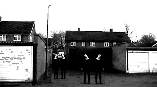


In this shot we added the shot of Alana, but this time we made 3 copies of her and then pasted them into the background shot. I think this is very effective as she looks like she may have come from a Mental Hospital with the way she is standing and the way you can see the mask on her face. This pose is very unsettling for the audience.
Possible Poster Ideas
After doing everything we could with editing our film we set out making a Poster for our film. We have to make a Film poster and a Film Magazine front cover.
We had the idea of cutting up a screen grab of the Killer, one black and white and one colour, and then layering them on top of each other so it looks like the pictures have been weaved together. I had a go at this on paint and the results were quite effective.


We had the idea of cutting up a screen grab of the Killer, one black and white and one colour, and then layering them on top of each other so it looks like the pictures have been weaved together. I had a go at this on paint and the results were quite effective.
I also had a go at changing the colour of the shot and then print screening the shot and then cutting out some of that and placing it on top of a shot of the Killer, again I think the results were quite effective but I think the Black and White/Colour shot will be more effective than the Colourful one.

Editing
Today we have started to edit our film together, we are again using Adobe Premier Elements editing software like we did last year, we have had a few technical problems with it on the school computers such as the files not saving so we had to save the file as a different version each time we wanted to save, which as you can imagine was quite irritating. But now these problems seem to be resolved and we are glad with this. Today we got all of our captured footage, and then uploaded it onto the Adobe software, as we had tried to upload it several times before we were not sure if it had actually uploaded but thankfully it had. so we had lots of copies of the files to play around with. We used different effects for the footage as we thought that the footage from involving the Killer would be in a different colour to that from Milly or Hannahs point of view. We decided on a grainy, old style of film with the lines going across the shot to give it a kind of western style, we used this effect on the shot of Milly being dragged through the mud in the woods, we also found out how to make this scene play backwards, so that Milly now goes forward, I think it looks creepier that way as you don't expect it!! We also made the scenes in which Hannah and Milly are talking in Millys bedroom darker so it looks like they are in the dark when we actually filmed the scene with the light on. We made the scenes with the Killer in them monochrome and darker as we think it looks effective and ties in with the theme of the Killers scenes being in black and white.
(add screengrabs)
Also on the scenes where Milly and Hannah are talking we have edited them to make it look like they are being filmed with a Night Vision camera, so we edited them to make them greenish and dark. We are then going to add a little red circle in the corner which is going to flash on and off and add the letters REC so it looks like the camera is actually recording.
 For this image we made the footage grainy, so it looked like an old style film.

 Here are the two images of Alana, The Killer, we made her monchrome as she looks very creepy.

(add screengrabs)
Also on the scenes where Milly and Hannah are talking we have edited them to make it look like they are being filmed with a Night Vision camera, so we edited them to make them greenish and dark. We are then going to add a little red circle in the corner which is going to flash on and off and add the letters REC so it looks like the camera is actually recording.


This is a shot of Hannah - The victims best friend. We made her green so it looks like she is being filmed on a night vision camera, I thought it was very effective.
Subscribe to:
Comments (Atom)